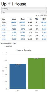
Year summary: We used 7,356 kWh and generated 7,256 kWh for a net of -100 kWh for the year.
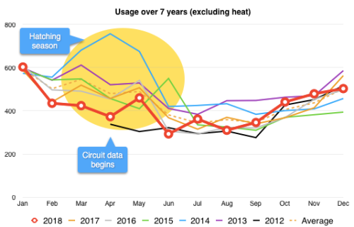
2018 is the first year we have not generated a solar surplus. In short, we produced 15% less solar than average, and used 5% more than average. That tipped the scales just enough to break our 6 year net zero running streak. On the long view however, we’ve generated a surplus of 9,157 kWh over the last 7 years since the house was built.

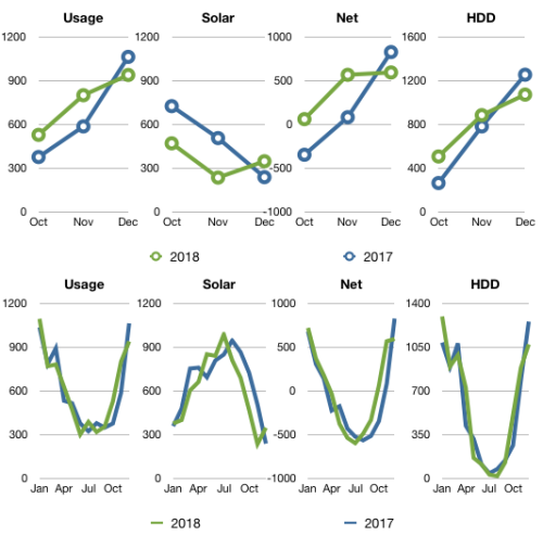
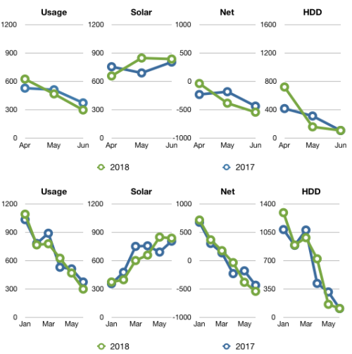
We were performing fairly normally until Q4. Let’s break down the numbers.
Q4 2018 summary: 7% colder, 12% more usage and 28% less sun as compared to Q4 2017.
In Q4 our total usage was 2,264 kWh, a 12% increase from our 2,022 kWh in 2017. We also generated 417 kWh less solar.
October through December was also the coldest forth quarter since we started recording temperature data at the house.
Overall, here’s how this quarter and the year compare.
| 2017 |
Usage |
Solar PV |
Net usage
or (surplus) |
Avg.
daily usage |
HDD |
| Total |
2,022 |
1,466 |
556 |
22.0 |
2,295 |
| Oct |
375 |
724 |
(349) |
12.1 |
262 |
| Nov |
585 |
505 |
80 |
19.5 |
780 |
| Dec |
1,062 |
237 |
825 |
34.2 |
1,253 |
| 2018 |
Usage |
Solar PV |
Net usage
or (surplus) |
Avg.
daily usage |
HDD |
| Total |
2,264 |
1,049 |
1,215 |
24.6 |
2,459 |
| Oct |
527 |
469 |
58 |
17.0 |
505 |
| Nov |
799 |
234 |
565 |
26.6 |
883 |
| Dec |
938 |
346 |
591 |
30.2 |
1,071 |
All values in kWh (except HDD which is base 65°F).
Year-over-year comparison
Here’s our progress for the first 7 years in the house.
|
Usage |
Solar PV |
Net usage
or (surplus) |
Avg.
daily usage |
HDD |
| Total |
49,447 |
58,605 |
(9,157) |
19.3 |
46,163 |
| 2012 |
5,601 |
8,856 |
(3,256) |
15.3 |
5,885 |
| 2013 |
7,206 |
8,575 |
(1,368) |
19.7 |
6,810 |
| 2014 |
8,108 |
8,348 |
(240) |
22.2 |
7,063 |
| 2015 |
7,141 |
8,694 |
(1,552) |
19.6 |
6,772 |
| 2016 |
6,838 |
8,910 |
(2,072) |
18.7 |
6,381 |
| 2017 |
7,198 |
7,966 |
(769) |
19.7 |
6,452 |
| 2018 |
7,356 |
7,256 |
100 |
20.2 |
6,800 |
All values in kWh (except HDD which is base 65°F).
Circuit-by-circuit

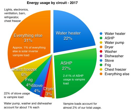
2018 was our third warmest year in the house (displacing 2017 to 4th place), although we continue to see wide extremes in temperature ranges (see temperature ranges below). The ASHP used 32% of the total as opposed to 27% last year, due mainly to the last 3 months being unusually cold and dark. Vampire loads decreased slightly this year. We cooked more in 2018 as the induction cooktop & stove vampire loads decreased in comparison to use. The combined vampire load for the stove, ASHP and solar inverter was 130 kWh in 2018, about 7 kWh less than last year.
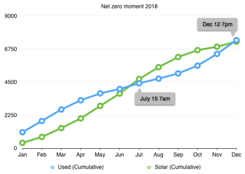
Net-zero moment(s)
Our first ‘net zero moment’ this year occurred on July 15 at 7am. Then sadly, on Dec 12 at 7pm, our curves reversed again. We had 31 days this year where the solar panels generated less than 1 kWh, mainly because they were covered in snow. We had 23 days last year and 13 days in 2016.
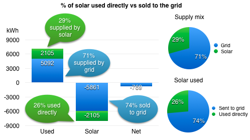
Where did all that solar go? 
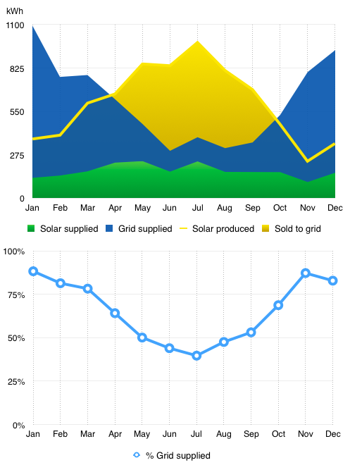
In 2018, 28% of our power needs were supplied by our own solar generation directly. The other 72% was supplied from the grid. Of the 7,256 kWh we generated in 2018, we only used used 28% ourselves. The other 72% we sold back to the grid at a greatly reduced price. We’ve tried various strategies to consume energy when the sun is shining, but the largest energy consumers, hot water and heat, don’t amend themselves easily to this type of use.
I track our net energy use by the calendar year since we moved in Jan 1, 2012. But the electric company tracks our yearly solar anniversary in June. Although we didn’t net out Jan to Jan, we did still produce more power June to June. This year we sold roughly 694 kWh back to the grid and earned $27.26, about $0.04/kWh from the power company. I’m going to bet we will not generate a surplus by June. We’ll have to wait till the Q2 report to find out.
National Grid does not tell us how much electricity would cost if we bought it from them. They only do that if you actually use more electricity than you generate. So I have to go to the NYSEDA website to find the state averages. Using their data, we would have paid about $9,124 over the past 7 years for the 49,448 kWh we’ve used if we didn’t have solar. Our solar cost $14,320 to purchase in 2011. In very simple terms that puts us at about 64% payback. At our current rate of use and the trending price of power, it will take us another 4 years to break even in simple terms.
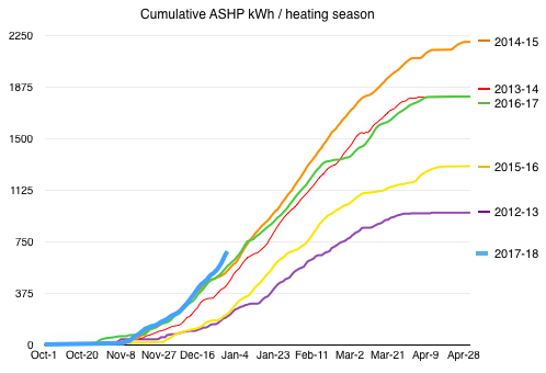
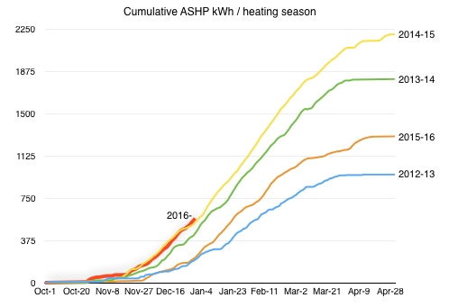
Air-Source Heat Pump performance
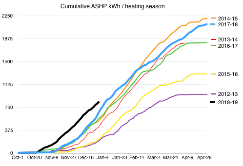
We started the 2017-18 heating season (thick blue line) about normal, then ramped up more than usual in December through mid February before ducking under the 2014-15 heating season curve. We finished up that season as the second highest energy use in the last 7 years. We used 2,328 kWh for heat in 2018. At the average electricity price this year, $0.19/kWh, that would be about $442. With 6,800 HDD in 2018, that is $0.065/HDD.
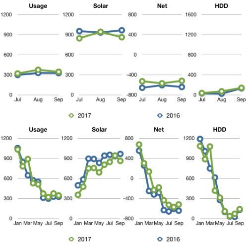
But the real shocker is the thick black curve showing the start of the 2018-19 season. Two things could be happening, it was colder than usual, and/or the ASHP is running inefficiently. I don’t have a good way to analyze the efficiency of the ASHP so I’m going to have to say it’s a colder than usual forth quarter. I already knew it was the coldest quarter we’ve recorded at the house. We turned on the heat October 23, earlier than ever before and left it on. Second earliest was Oct 25, 2014 and that was only for a few days. Since we are a passive solar house I also wanted to look at how sunny it was this last quarter so I pulled together a new chart showing solar (proxy for solar heat gain, except when covered by snow), heating degree days (HDD) and ASHP energy usage.

Notice the divergence of the HDD and solar lines in 2018, the largest we’ve experienced since 2014. In general, the higher the HDD the more heat required, but solar heat gain can lower our heat energy requirement as it did in 2012, 13, 16 and 17.
Since this year is atypical, I thought I’d show our ASHP usage broken down by temperature buckets in comparison to our 2017 numbers. Clearly the elevated 20-30, 30-40 and 40-50 degree ranges for 2018 are heavily weighted by this last quarter.

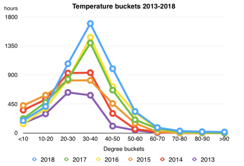
The same is visible when we compare all the hours the ASHP has operated each year by 10 degree buckets. 2018 stands out for the 20-50 degree range.
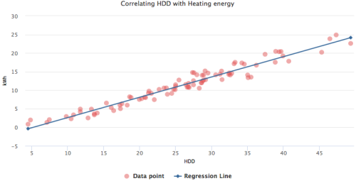
But it’s the following chart that makes me think the ASHP is working just as efficiently as the last 6 years. This chart plots HDD vs kWh used over the last 7 years, using yearly data.

If the data point was severely out of sync with the regression line, then I’d be more worried. I’m not a data scientist, so I’ll have to proceed until we get more data (or I get smarter).
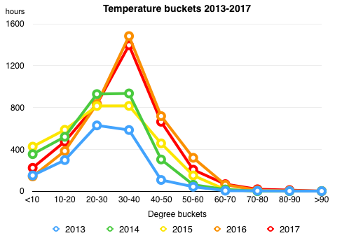
Temperatures
The temperate bucket chart I usually create for the ASHP made me wonder what the general temperature buckets are and which buckets are increasing over the last 7 years.
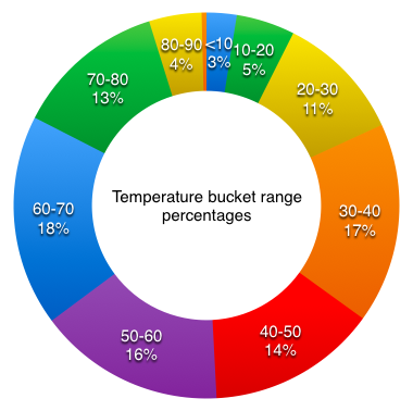
The ‘snowbirds’ know that our area has a large number of hours in the 60-70 degree range, followed closely by the 30-40 degree range and then the 50-60 degree range.

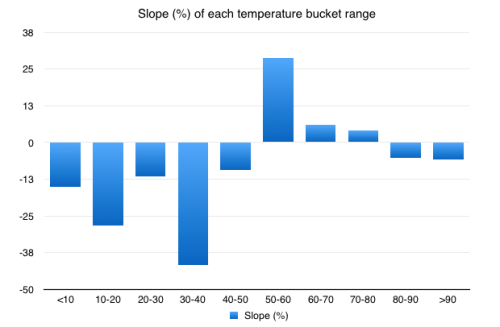
The 30-40 and 50-70 degree ranges may have accounted for the most hours in the last 7 years, but the 50-80 degree range is increasing more quickly overall in comparison to the <50 and > 80 degree range. In particular, the 50-60 degree range is increasing at a rate of 29%. Upstate NY is the new Florida (based on a small sample of 7 years temperature data).
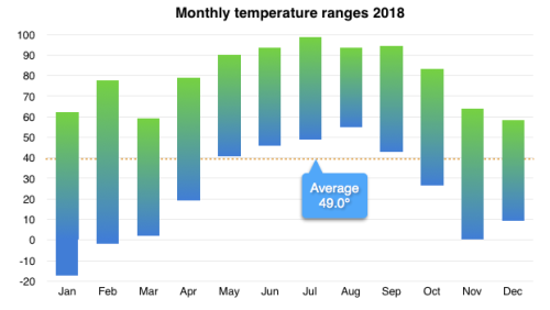

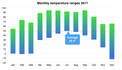
We experienced our largest temperature range this year out of the last 7 years, 115.9°. Our coldest temperature was -17.1° on January 7th at 7am. Our high was 98.8°, the highest recorded since we moved in, on July 2 at 1pm.
The average temperature for 2018 was 48.9°, 0.5° down from 49.4° in 2017.
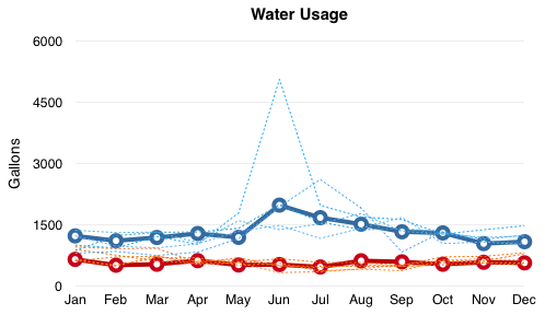
Water

We have been fairly consistent in our hot water usage. Over the year we averaged 17.2 gal/day. That hot water requires 243 watts/gallon to heat. We used a total 21,725 gallons of water in 2018, 59.5 gal/day, as compared to 22,406 gallons of water in 2017 and 26,735 gallons in 2016. It took 55 kWh to pump that water out of the ground. Our water pump used about 2.6 Wh/gal this year versus 3.1 Wh/gal last year. Pump is doing well. 🙂
Happy 2018 everyone.
You can see heat maps and detailed charts of temperature and electrical usage at netplusdesign.com. View hourly, daily and monthly values for solar, usage, net usage, temperatures and HDD.


